7 Critical Checkout Mistakes and How to avoid them

Posted On: Sep 4, 2018
Categories: Shopping Carts and E-Commerce Platforms: A Complete Guide , Conversion Optimization
A business will be perceived online just as well as it is viewed. This means having a functional, efficient and well-designed checkout page in place is essential to survive in this industry. However, many organizations lack such infrastructure which amounts to their downfall.
A novice website can reduce even successful or potentially gifted businesses to dust. This necessitates the implementation of websites which are optimized to serve customers best and have their requirements taken into consideration when being built. In doing such, organizations ensure that their websites and businesses will continue to flourish and generate revenue.
So, what’s the problem? Optimizing Order Process with Quick Checkout
Many checkouts nowadays are not optimized and are built without prior planning as to what the customer wants and what will be their perspective when they visit the website. This means businesses suffer the consequences of an ill-conceived website which not only fails to generate revenue but ends up leading the businesses to loss.
There are many kinds of damages that business has to suffer as a result of unplanned websites. Following are 7 primary lessons which can be derived as a result of implementing unoptimized websites:
- Delay kills
Delays in order during loading can pose serious hazards. Leads are easily lost due to these lags. The online store suffers from degradation in reputation as well. Surveys confirmed that 57 percent of customers would simply abandon a site if delay during operations exceeded 3 seconds.
From these customers 83 percent will not even bother to visit the site again and this permanently slashes down these potential leads. PrestaShop One Page checkout is the perfect solution to such issues.
It is an excellent ordering process module to integrate onto sites to ensure smooth customer experience. This is achieved through the one page format, which eradicates the need for multiple pages to load. Customer simply enters information and confirms sales in one checkout step.
- Remind the Customer about their Cart
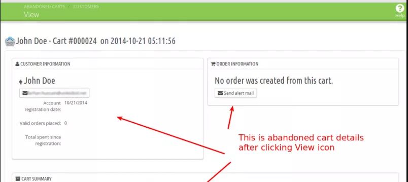
It is natural for customers to forget what they had entered in their shopping carts. 88 percent customers end up abandoning cart because they become unsure of what they had purchased and are apprehensive about completing checkout.
A simple cart reminder at start of order as provided by PrestaShop quick Checkout is an excellent feature. It reminds customers about what they had purchased when a customer enters checkout, which is considered great feedback service by customer.
- Layout matter
Checkout page layout is vital for success and paired with page style, it becomes a deciding factor about how users will perceive checkout at first sight. Instead of relying on simple, unrefined layouts without proper flow, use a module which provides options to personalize theme and layout.
Simple Checkout in Presta is well suited in this manner, permitting theme personalization of title and background colours to attract users. With options between one and two column page, admins can choose their format as per their page length. One column is suited for lesser fields whereas two columns adjusts more information in one page.
- Multiple pages
Multistep Checkouts are commonly used but filling in page after page sometimes takes too much time. 50 percent of visitors are likely to result in cart abandonment if there are too many steps involved in registering their product with the company.
All this can be avoided by simply formatting all required data in one concise page as the PrestaShop fast checkout does. By asking all information in one go, the customer is satisfied and is more than willing to continue with purchase of product.
- Accounts are not for everyone
Most sites have the necessity for registration before a product can be purchased. This is a hazardous approach towards business and marketing because customers are unwilling to go an extra round of adding contact details when they are already doing so in the product purchase.
It seems illogical to ask for an email ID in case the customer is supplying all necessary information including personal details which can be used to track them and are verified. This information is ideally used by Quick checkout module which automatically creates an account from the information user enters.
This saves the hassle for account creation as already available personal information creates a usable account which solves the entire scenario.
- Privacy Protection
One of the biggest customer fears is that their personal data will be subject to cyber theft. This leaves many of them uncertain about entering such information and is a major factor for cart abandonment.
Multistep ordering process is commonly in place, but can be easily manipulated for phishing attacks. During next page reloading, the cyber criminals switch the original page with a copy which looks exactly like the original one. All that information is then transferred into wrong hands.
Single click order module is already immune to such attacks. Since it only needs one page to gather all data, phishing attacks are useless against it.
Check also: Prestashop custom checkout fields
- Additional shipping
Apart from other added costs, having shipping costs as extra in the checkout page is the perfect way to scare off customers. Integrate the cost of shipping in overall sales cost, which makes it easier for customer to accept. Make shipping over a certain amount free, which also encourages customers to purchase more products in one go.
Modules such as Single page checkout incorporate minimum purchase option at back-end which already adds taxes and shipping costs into order. This saves customer the irritation of calculating the costs on their own.
Avoid Mistakes, boost Conversion Rates
Checkouts are the final stage which seals the deal between customer and business. This backbone must be strong and secure to ensure customers are attracted towards business. With a great module such as PrestaShop One Page checkout in place, there is no reason visitors will result in cart abandonment from your end or get confused midway in their transactions.


